在本章中,我们将讨论Material Design Lite中的不同布局. HTML5的容器元素为
:
< div> : ;提供HTML内容的通用容器.
< header> : 代表标题部分.
< footer> : 表示页脚部分.
< article> : 代表文章.
< section> : 为各种类型的部分提供通用容器.
MDL提供各种CSS类,以对容器应用各种预定义的视觉和行为增强功能.下表列出了可用的类及其效果.
<td style ="text-align:center; vertical-align:middle ;>> 8
| Sr.No. | Class Name&描述 |
|---|---|
| 1 | mdl-layout 将容器标识为MDL组件.在外部容器元素上是必需的. |
| 2 | mdl-js-layout 向布局添加基本MDL行为.在外部容器元素上是必需的. |
| 3 | mdl-layout__header 将容器标识为MDL组件.标题元素必需. |
| 4 | mdl-layout-icon 用于添加应用程序图标.如果两者都可见,则被菜单图标覆盖.可选的图标元素. |
| 5 | mdl-layout__header-row 将容器标识为MDL标题行.标题内容容器必需. |
| 6 | mdl-layout__title 标识布局标题文本.布局标题容器需要. |
| 7 | mdl-layout-spacer 用于对齐标题或抽屉内的元素.它增长以填补剩余空间.通常用于将元素对齐到右侧. div上的可选布局标题. |
8 | mdl-navigation 将容器标识为MDL导航组.导航元素必需. |
| 9 | mdl-navigation__link 将锚标识为MDL导航链接.标题和/或抽屉锚元素需要. |
| 10 | mdl-layout__drawer 将容器标识为MDL布局抽屉.抽屉容器元素需要. |
| 11 | mdl-layout__content 将容器标识为MDL布局内容.主元素必需. |
| 12 | mdl-layout__header - scroll 使标题滚动内容. header元素可选. |
| 13 | mdl-layout - 固定抽屉 使抽屉始终可见并打开更大的屏幕.在外部容器元素上可选,而不在抽屉容器元素上. |
| 14 | mdl-layout - fixed-header 制作标题始终可见,即使在小屏幕中也是如此.外容器元素可选. |
| 15 | mdl-layout - 仅限大屏幕 隐藏较小的元素屏幕.在mdl-layout的任何后代上都是可选的. |
| 16 | mdl-layout - 仅限小屏幕 隐藏大屏幕上的元素.在mdl-layout的任何后代上都是可选的. |
| 17 | mdl-layout__header - waterfall 允许"瀑布"效果有多个标题行. header元素可选. |
| 18 | mdl-layout__header - 透明 使标题透明并在布局背景上绘制. header元素可选. |
| 19 | mdl-layout__header - seamed 使用没有阴影的标头. header元素可选. |
| 20 | mdl-layout__tab-bar 将容器标识为MDL标签栏.标题内的容器元素必需(标签布局). |
| 21 | mdl-layout__tab 将锚标识为MDL标签链接.标签栏锚元素必需. |
| 22 | 是活跃的 将标签标识为默认活动标签.选项卡栏锚元素和关联的标签栏元素可选. |
| 23 | mdl-layout__tab-panel 将容器标识为制表符内容小组.标签部分元素必需. |
| 24 | mdl-layout - fixed-tabs 使用固定标签而不是默认标签可滚动的标签.外部容器元素可选,而不是标题内的容器. |
以下示例显示了mdl的使用-layout类用于设置各种容器的样式.
固定抽屉
要创建具有固定抽屉但没有标题的模板,请使用以下MDL类.
mdl-layout : 将div标识为MDL组件.
mdl-js-layout : 将基本MDL行为添加到外部div.
mdl-layout - fixed-drawer : 使抽屉始终可见并在较大的屏幕中打开.
mdl-layout__drawer : 将div标识为MDL布局抽屉.
mdl-layout-title : 标识布局标题文本.
mdl-navigation : 将div标识为MDL导航组.
mdl-navigation__link : 将锚标识��MDL导航链接.
mdl-layout__content : 将div标识为MDL布局内容.
mdl_fixeddrawer.htm
<html> <head> <link rel = "stylesheet" href = "https://storage.googleapis.com/code.getmdl.io/1.0.6/material.indigo-pink.min.css"> <script src = "https://storage.googleapis.com/code.getmdl.io/1.0.6/material.min.js"> </script> <link rel = "stylesheet" href = "https://fonts.googleapis.com/icon?family=Material+Icons"> </head> <body> <!-- No header, and the drawer stays open on larger screens (fixed drawer).--> <div class = "mdl-layout mdl-js-layout mdl-layout--fixed-drawer"> <div class = "mdl-layout__drawer"> <span class = "mdl-layout-title">HTML5 Tutorial</span> <nav class = "mdl-navigation"> <a class = "mdl-navigation__link" href = "">Home</a> <a class = "mdl-navigation__link" href = "">About</a> </nav> </div> <main class = "mdl-layout__content"> <div class = "page-content" style = "padding-left:100px;">Hello World!</div> </main> </div> </body></html>
Fixed Header
要使用固定的标头创建模板,请使用其他MDL类。
mdl-layout--fixed-header : 使标题始终可见,即使在小屏幕上也是如此。
mdl_fixedheader.htm
<html> <head> <link rel = "stylesheet" href = "https://storage.googleapis.com/code.getmdl.io/1.0.6/material.indigo-pink.min.css"> <script src = "https://storage.googleapis.com/code.getmdl.io/1.0.6/material.min.js"> </script> <link rel = "stylesheet" href = "https://fonts.googleapis.com/icon?family=Material+Icons"> </head> <body> <!-- Always shows a header, even in smaller screens. --> <div class = "mdl-layout mdl-js-layout mdl-layout--fixed-header"> <header class = "mdl-layout__header"> <div class = "mdl-layout__header-row"> <!-- Title --> <span class = "mdl-layout-title">HTML5 Tutorial</span> <!-- Add spacer, to align navigation to the right --> <div class = "mdl-layout-spacer"></div> <!-- Navigation --> <nav class = "mdl-navigation"> <a class = "mdl-navigation__link" href = "" style = "color:gray">Home</a> <a class = "mdl-navigation__link" href = "" style = "color:gray">About</a> </nav> </div> </header> <div class = "mdl-layout__drawer"> <span class = "mdl-layout-title">HTML5 Tutorial</span> <nav class = "mdl-navigation"> <a class = "mdl-navigation__link" href = "">Home</a> <a class = "mdl-navigation__link" href = "">About</a> </nav> </div> <main class = "mdl-layout__content"> <div class = "page-content">Hello World!</div> </main> </div> </body></html>
Fixed Header and Drawer
要创建带有固定标题和固定抽屉的模板,请使用以下其他MDL类。
mdl-layout--fixed-drawer:使抽屉始终可见并在大屏幕中打开。
mdl-layout--fixed-header:使标题始终可见,即使在小屏幕上也是如此。
mdl_fixedheader.htm
<html> <head> <link rel = "stylesheet" href = "https://storage.googleapis.com/code.getmdl.io/1.0.6/material.indigo-pink.min.css"> <script src = "https://storage.googleapis.com/code.getmdl.io/1.0.6/material.min.js"> </script> <link rel = "stylesheet" href = "https://fonts.googleapis.com/icon?family=Material+Icons"> </head> <body> <!-- The drawer is always open in large screens. The header is always shown, even in small screens. --> <div class = "mdl-layout mdl-js-layout mdl-layout--fixed-drawer mdl-layout--fixed-header"> <header class = "mdl-layout__header"> <div class = "mdl-layout__header-row"> <!-- Title --> <span class = "mdl-layout-title">HTML5 Tutorial</span> <!-- Add spacer, to align navigation to the right --> <div class = "mdl-layout-spacer"></div> <!-- Navigation --> <nav class = "mdl-navigation"> <a class = "mdl-navigation__link" href = "" style = "color:gray">Home</a> <a class = "mdl-navigation__link" href = "" style = "color:gray">About</a> </nav> </div> </header> <div class = "mdl-layout__drawer"> <span class = "mdl-layout-title">HTML5 Tutorial</span> <nav class = "mdl-navigation"> <a class = "mdl-navigation__link" href = "">Home</a> <a class = "mdl-navigation__link" href = "">About</a> </nav> </div> <main class = "mdl-layout__content"> <div class = "page-content">Hello World!</div> </main> </div> </body></html>
Scrolling Header
要创建带有滚动标题的模板,请使用以下MDL类。
mdl-layout--header--scroll :使标题随内容滚动。
mdl_scrollingheader.htm
<html> <head> <link rel = "stylesheet" href = "https://storage.googleapis.com/code.getmdl.io/1.0.6/material.indigo-pink.min.css"> <script src = "https://storage.googleapis.com/code.getmdl.io/1.0.6/material.min.js"> </script> <link rel = "stylesheet" href = "https://fonts.googleapis.com/icon?family=Material+Icons"> </head> <body> <!-- Uses a header that scrolls with the text, rather than staying locked at the top --> <div class = "mdl-layout mdl-js-layout "> <header class = "mdl-layout__header mdl-layout__header--scroll"> <div class = "mdl-layout__header-row"> <!-- Title --> <span class = "mdl-layout-title">HTML5 Tutorial</span> <!-- Add spacer, to align navigation to the right --> <div class = "mdl-layout-spacer"></div> <!-- Navigation --> <nav class = "mdl-navigation"> <a class = "mdl-navigation__link" href = "">Home</a> <a class = "mdl-navigation__link" href = "">About</a> </nav> </div> </header> <div class = "mdl-layout__drawer"> <span class = "mdl-layout-title">HTML5 Tutorial</span> <nav class = "mdl-navigation"> <a class = "mdl-navigation__link" href = "">Home</a> <a class = "mdl-navigation__link" href = "">About</a> </nav> </div> <main class = "mdl-layout__content"> <div class = "page-content" style = "padding-left:100px;">Hello World! <br/><br/><br/><br/><br/><br/><br/><br/>... <br/><br/><br/><br/><br/><br/><br/><br/>... <br/><br/><br/><br/><br/><br/><br/><br/>... <br/><br/><br/><br/><br/><br/><br/><br/>... <br/><br/><br/><br/><br/><br/><br/><br/>... <br/><br/><br/><br/><br/><br/><br/><br/>... <br/><br/><br/><br/><br/><br/><br/><br/>... <br/><br/><br/><br/><br/><br/><br/><br/>... <br/><br/><br/><br/><br/><br/><br/><br/>... <br/><br/><br/><br/><br/><br/><br/><br/>... <br/><br/><br/><br/><br/><br/><br/><br/>... <br/><br/><br/><br/><br/><br/><br/><br/>... <br/><br/><br/><br/><br/><br/><br/><br/>... <br/><br/><br/><br/><br/><br/><br/><br/>... <br/><br/><br/><br/><br/><br/><br/><br/>... <br/><br/><br/><br/><br/><br/><br/><br/>... <br/><br/><br/><br/><br/><br/><br/><br/>... <br/><br/><br/><br/><br/><br/><br/><br/>... <br/><br/><br/><br/><br/><br/><br/><br/>... <br/><br/><br/><br/><br/><br/><br/><br/>... </div> </main> </div> </body></html>
Contracting Header
要创建带有随着页面向下滚动而收缩的标题的模板,请使用以下MDL类。
mdl-layout__header--waterfall :允许带有多个标题行的"瀑布"效果。
mdl_waterfallheader.htm
<html> <head> <link rel = "stylesheet" href = "https://storage.googleapis.com/code.getmdl.io/1.0.6/material.indigo-pink.min.css"> <script src = "https://storage.googleapis.com/code.getmdl.io/1.0.6/material.min.js"> </script> <link rel = "stylesheet" href = "https://fonts.googleapis.com/icon?family=Material+Icons"> </head> <body> <!-- The drawer is always open in large screens. The header is always shown, even in small screens. --> <div class = "mdl-layout mdl-js-layout "> <header class = "mdl-layout__header mdl-layout__header--waterfall"> <!-- Top row, always visible --> <div class = "mdl-layout__header-row"> <!-- Title --> <span class = "mdl-layout-title">HTML5 Tutorial</span> <!-- Add spacer, to align navigation to the right --> <div class = "mdl-layout-spacer"></div> </div> <!-- Bottom row, not visible on scroll --> <div class = "mdl-layout__header-row"> <div class = "mdl-layout-spacer"></div> <!-- Navigation --> <nav class = "mdl-navigation"> <a class = "mdl-navigation__link" href = "">Home</a> <a class = "mdl-navigation__link" href = "">About</a> </nav> </div> </header> <div class = "mdl-layout__drawer"> <span class = "mdl-layout-title">HTML5 Tutorial</span> <nav class = "mdl-navigation"> <a class = "mdl-navigation__link" href = "">Home</a> <a class = "mdl-navigation__link" href = "">About</a> </nav> </div> <main class = "mdl-layout__content"> <div class = "page-content" style = "padding-left:100px;">Hello World! <br/><br/><br/><br/><br/><br/><br/><br/>... <br/><br/><br/><br/><br/><br/><br/><br/>... <br/><br/><br/><br/><br/><br/><br/><br/>... <br/><br/><br/><br/><br/><br/><br/><br/>... <br/><br/><br/><br/><br/><br/><br/><br/>... <br/><br/><br/><br/><br/><br/><br/><br/>... <br/><br/><br/><br/><br/><br/><br/><br/>... <br/><br/><br/><br/><br/><br/><br/><br/>... <br/><br/><br/><br/><br/><br/><br/><br/>... <br/><br/><br/><br/><br/><br/><br/><br/>... <br/><br/><br/><br/><br/><br/><br/><br/>... <br/><br/><br/><br/><br/><br/><br/><br/>... <br/><br/><br/><br/><br/><br/><br/><br/>... <br/><br/><br/><br/><br/><br/><br/><br/>... <br/><br/><br/><br/><br/><br/><br/><br/>... <br/><br/><br/><br/><br/><br/><br/><br/>... <br/><br/><br/><br/><br/><br/><br/><br/>... <br/><br/><br/><br/><br/><br/><br/><br/>... <br/><br/><br/><br/><br/><br/><br/><br/>... <br/><br/><br/><br/><br/><br/><br/><br/>... </div> </main> </div> </body></html>
具有可滚动标签的固定标题
要使用带有可滚动标签的标题创建模板,请使用以下MDL类。
mdl-layout__tab-bar:将容器标识为MDL标签栏。
mdl-layout__tab :将锚点标识为MDL标签链接。
mdl-layout__tab-panel :将容器标识为选项卡内容面板。
mdl_scrollabletabheader.htm
<html> <head> <link rel = "stylesheet" href = "https://storage.googleapis.com/code.getmdl.io/1.0.6/material.indigo-pink.min.css"> <script src = "https://storage.googleapis.com/code.getmdl.io/1.0.6/material.min.js"> </script> <link rel = "stylesheet" href = "https://fonts.googleapis.com/icon?family=Material+Icons"> </head> <body> <!-- The drawer is always open in large screens. The header is always shown, even in small screens. --> <div class = "mdl-layout mdl-js-layout mdl-layout--fixed-header"> <header class = "mdl-layout__header"> <!-- Top row, always visible --> <div class = "mdl-layout__header-row"> <!-- Title --> <span class = "mdl-layout-title">HTML5 Tutorial</span> </div> <!-- Tabs --> <div class = "mdl-layout__tab-bar mdl-js-ripple-effect"> <a href = "#scroll-tab-1" class = "mdl-layout__tab is-active">Tab 1</a> <a href = "#scroll-tab-2" class = "mdl-layout__tab">Tab 2</a> <a href = "#scroll-tab-3" class = "mdl-layout__tab">Tab 3</a> </div> </header> <div class = "mdl-layout__drawer"> <span class = "mdl-layout-title">HTML5 Tutorial</span> <nav class = "mdl-navigation"> <a class = "mdl-navigation__link" href = "">Home</a> <a class = "mdl-navigation__link" href = "">About</a> </nav> </div> <main class = "mdl-layout__content"> <section class = "mdl-layout__tab-panel is-active" id = "scroll-tab-1"> <div class = "page-content">Tab 1 Contents</div> </section> <section class = "mdl-layout__tab-panel" id = "scroll-tab-2"> <div class = "page-content">Tab 2 Contents</div> </section> <section class = "mdl-layout__tab-panel" id = "scroll-tab-3"> <div class = "page-content">Tab 3 Contents</div> </section> </main> </div> </body></html>
带固定标签的固定头
若要创建带有带有固定选项卡的标题的模板,请使用以下附加的MDL类。
mdl-layout--fixed-tabs :使用固定选项卡,而不是默认的可滚动选项卡。
mdl_fixedtabheader.htm
<html> <head> <link rel = "stylesheet" href = "https://storage.googleapis.com/code.getmdl.io/1.0.6/material.indigo-pink.min.css"> <script src = "https://storage.googleapis.com/code.getmdl.io/1.0.6/material.min.js"> </script> <link rel = "stylesheet" href = "https://fonts.googleapis.com/icon?family=Material+Icons"> </head> <body> <!-- The drawer is always open in large screens. The header is always shown, even in small screens. --> <div class = "mdl-layout mdl-js-layout mdl-layout--fixed-header mdl-layout--fixed-tabs"> <header class = "mdl-layout__header"> <!-- Top row, always visible --> <div class = "mdl-layout__header-row"> <!-- Title --> <span class = "mdl-layout-title">HTML5 Tutorial</span> </div> <!-- Tabs --> <div class = "mdl-layout__tab-bar mdl-js-ripple-effect"> <a href = "#scroll-tab-1" class = "mdl-layout__tab is-active">Tab 1</a> <a href = "#scroll-tab-2" class = "mdl-layout__tab">Tab 2</a> <a href = "#scroll-tab-3" class = "mdl-layout__tab">Tab 3</a> </div> </header> <div class = "mdl-layout__drawer"> <span class = "mdl-layout-title">HTML5 Tutorial</span> <nav class = "mdl-navigation"> <a class = "mdl-navigation__link" href = "">Home</a> <a class = "mdl-navigation__link" href = "">About</a> </nav> </div> <main class = "mdl-layout__content"> <section class = "mdl-layout__tab-panel is-active" id = "scroll-tab-1"> <div class = "page-content">Tab 1 Contents</div> </section> <section class = "mdl-layout__tab-panel" id = "scroll-tab-2"> <div class = "page-content">Tab 2 Contents</div> </section> <section class = "mdl-layout__tab-panel" id = "scroll-tab-3"> <div class = "page-content">Tab 3 Contents</div> </section> </main> </div> </body></html>
免责声明:以上内容(如有图片或视频亦包括在内)有转载其他网站资源,如有侵权请联系删除
-
设计总结|如何更好地表达活动品牌?

-

谈谈“目标思维”的落地
编辑导读:我们在做数据分析之前,一定要搞清楚需求方的目标到底是什么,要根据目标来重新定义业务方提出的问题,这就是目标思维。目标思维有多重要呢?应该如何落地呢...
-
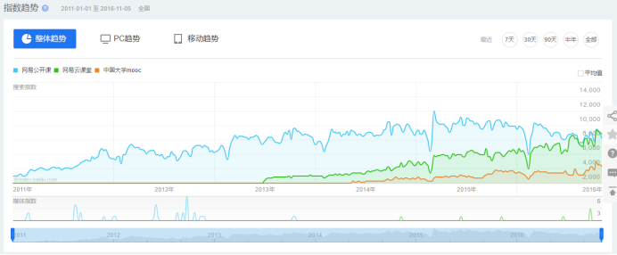
在线教育平台竞品分析:网易云课堂vs腾讯课堂
本文从移动端出发,对当前比较热门的两款在线教育平台软件-网易云课堂和腾讯课堂进行比较和分析,不足之处还请大家多提意见。 市场分析 随着国内互联网技术的发展和移...
-
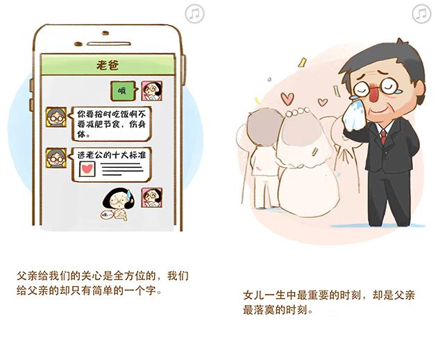
即学即用|父亲节活动的4种运营策略


-
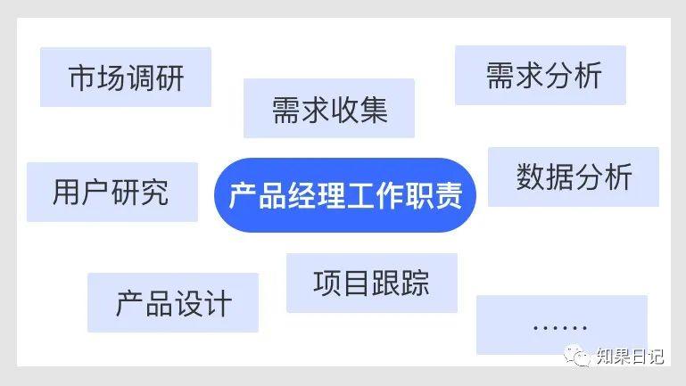
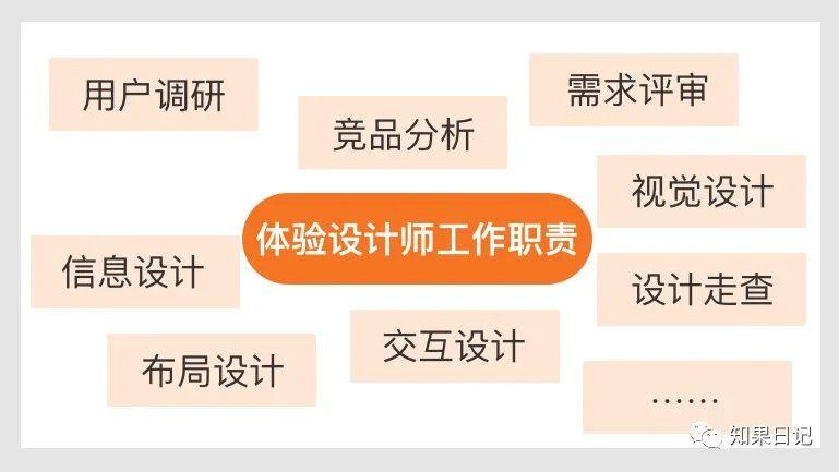
B端产品经理和体验设计师的工作职责边界梳理

-
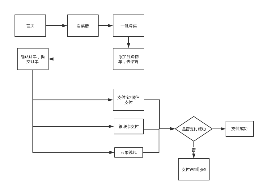
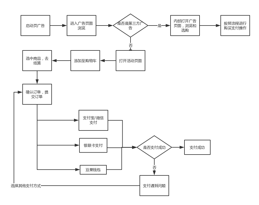
豆果美食电商分支用户体验报告及建议

-

数据分析师如何提高工作效率
在我们的日常工作中,提高工作效率是每个岗位都需要实现的,在工作中,面对比较凌乱的事情时,首先我们需要梳理清楚,按重要级进行开展;本文作者分享了关于...
-
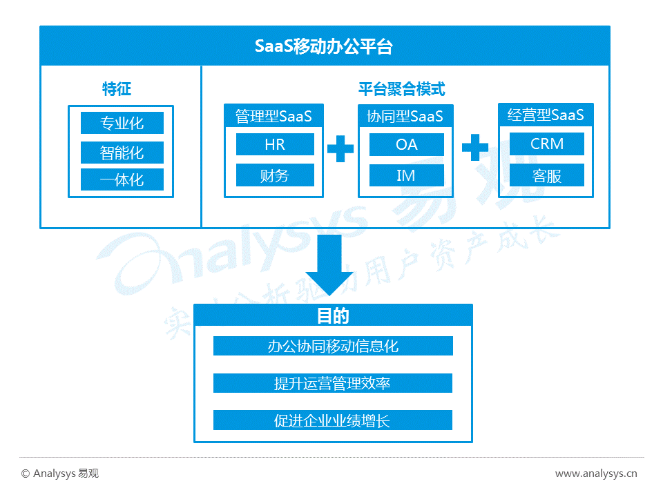
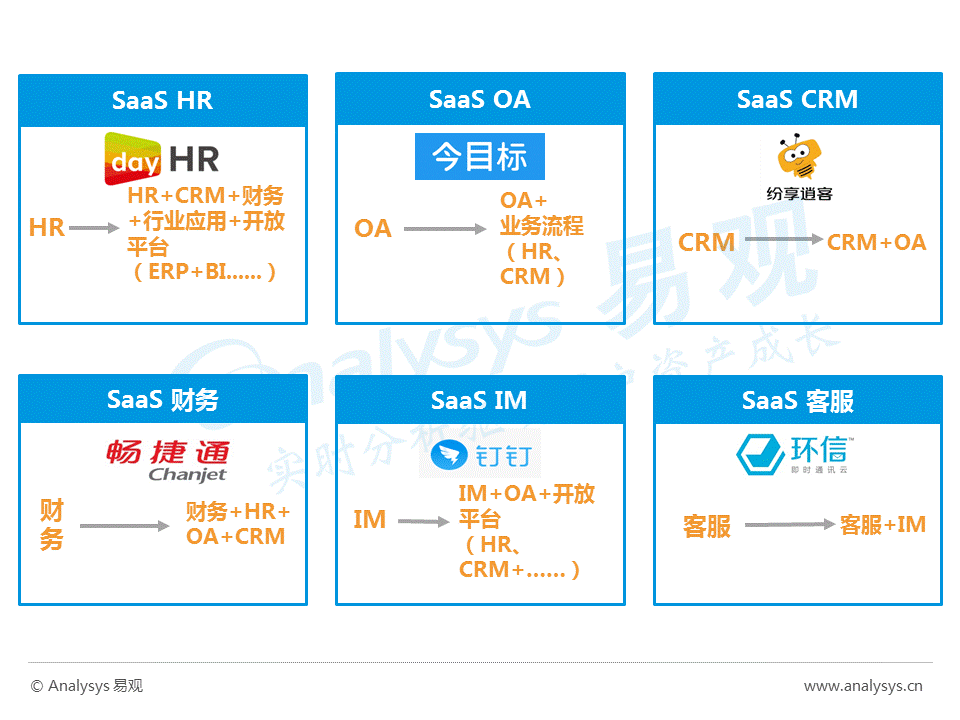
2016中国云计算SaaS移动办公平台年度综合报告

-
网易大布局教育事业:网易公开课、网易云课堂和MOOC分析

-
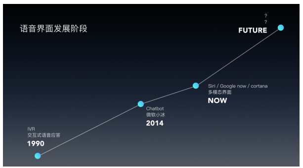
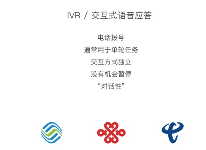
一篇文章搞懂语音交互的来龙去脉